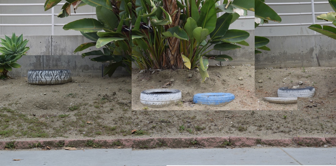
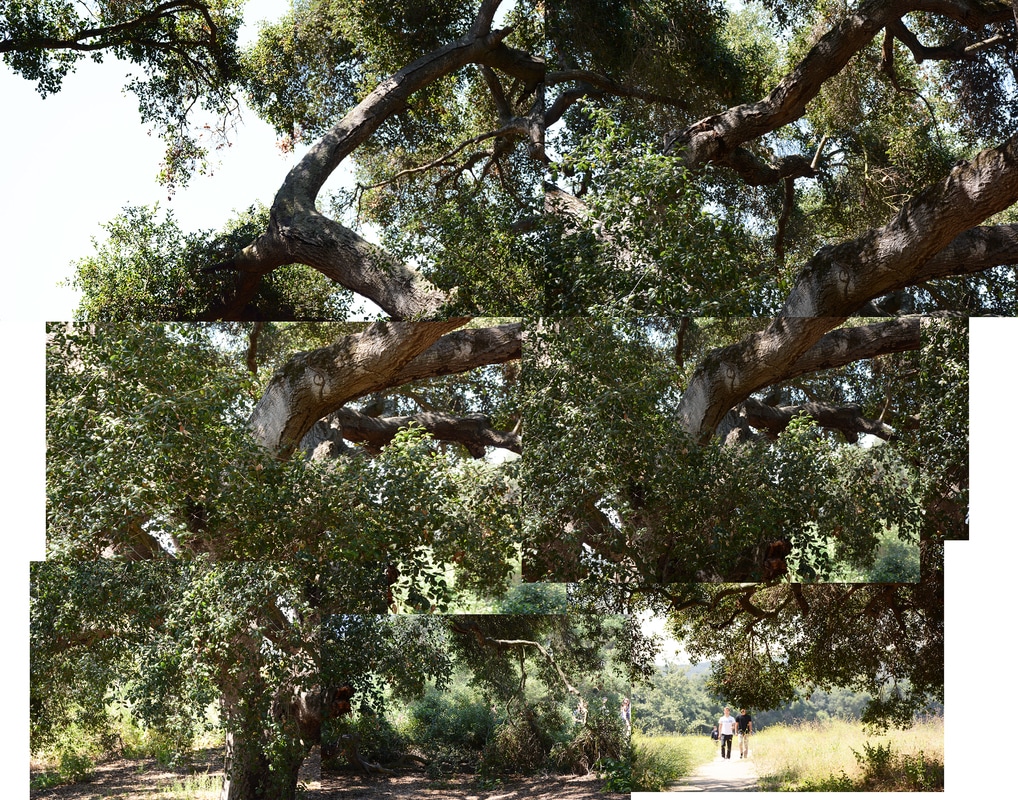
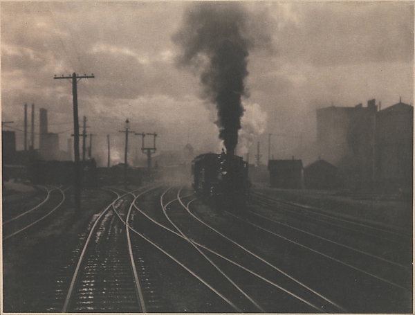
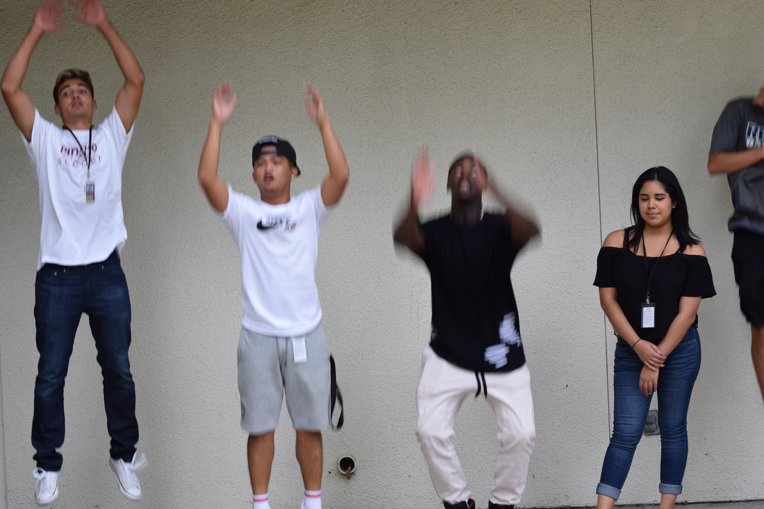
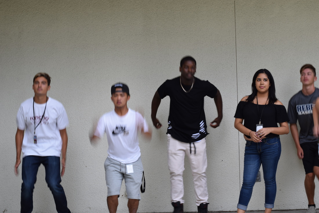
David Hockney was born in Bradford, United Kingdom, in 1937. He did his early education at Wellington Primary School and then got a scholarship to Bradford Grammar School. Then from 1953 to 1957 he attended the Bradford College of Art. Hockney is considered an important contributor to the Pop Art movement. The “David Hockney” style he created was when he took a series of pictures and fixed them together to create one photo. From those photos he would create paintings but later realized that the photos put together, the way he did it, alone is a type of art.
To create the “David Hockney” photos in photoshop, I had to first go to file and then click new which created a white square that I could fit the photos into. Then I dragged photos over to the platform starting with the top left photo, which made a layermask. Then continued that process, going from left to right then down and left to right again, with other photos to come up with the ending product. Each photo size could vary. Finally I merged the layers together and saved it has a jpeg file.
To create the “David Hockney” photos in photoshop, I had to first go to file and then click new which created a white square that I could fit the photos into. Then I dragged photos over to the platform starting with the top left photo, which made a layermask. Then continued that process, going from left to right then down and left to right again, with other photos to come up with the ending product. Each photo size could vary. Finally I merged the layers together and saved it has a jpeg file.
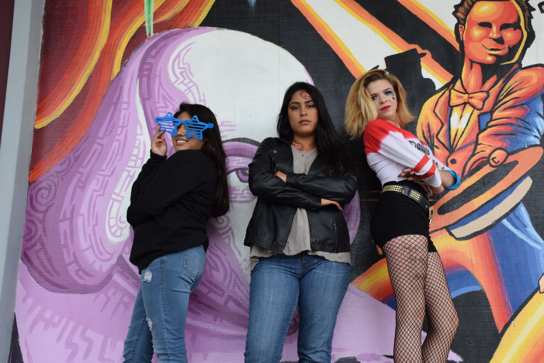
Magazine Cover
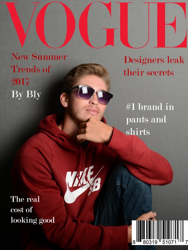
I chose the magazine vogue because it’s always about things like fashion, which i like and it’s not all about fake drama. To get my magazine cover like the vogue one I had a photo of Bly just doing a pose and then I put the title the exact same as their other magazines. The font style I used was Modern No. 20 Regular because it gives the cover a more interesting loot to it rather than doing just ariel which is sometimes boring. That’s the same reason I chose to do the red font too and it also makes the magazine more similar to the actual magazines but I added white as well so that it wasn’t all just one single color since the title was already red too.
To get the photograph I just had Bly do any poses he wanted so I would have a variety of pictures to chose from and when he randomly does it it makes it look like a more natural pose. A strobe light is a light replacing natural light which sends a large and bright flash to it, to make all colors incorporated all visible. A model light reflects the light from one side to the other and it will point the light right where you want it to go. A softbox is a light with q material over it creating a softer,more natural look.
Finally the reflector helps with the different colors in one specific area. For example you could use the silver side of the reflector to get a more vibrant light specifically on the face of the model. Or you could use the gold side to get a softer more “vintage’ kind of look. A grey card helps to see if the lighting is good in the setup and the exposure on the camera is correct. You can check by taking picture with the person holding up the card and then you check the photo and if the white is the same color then the lighting and everything is okay.
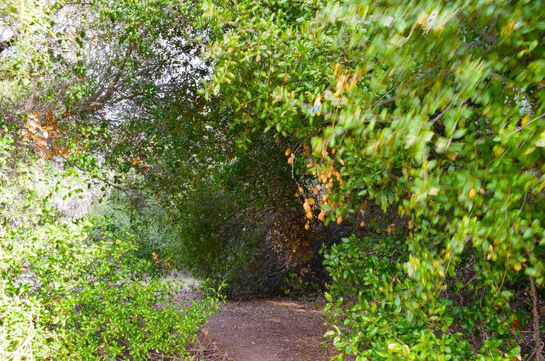
Family photos
Del Mar Fair
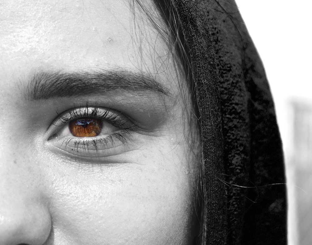
Looking through with color: This photograph was taken at my school for a photography project. The compositional rule is rule of thirds. The camera I used to take this photo was a Nikon D5300 with a 18- 140mm lens. To create this image I went in photo shop and made the whole photo black and white, making sure that it wasn’t too light or too dark. Then I went back and used the erase tool to make it so that only the white of the eye and the color actually had their color. Next I brightened the color of the eye to make sure it wasn’t dull or anything, mostly since there was already the black and white around the rest of it. My photograph falls into the category of digital painting and illustration since I used Photoshop to do something “unnatural’ to the photograph.
Lightroom
Sports
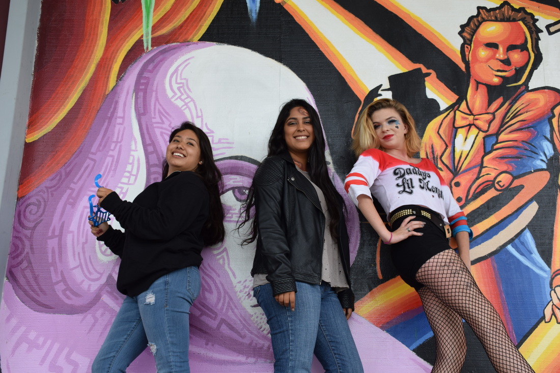
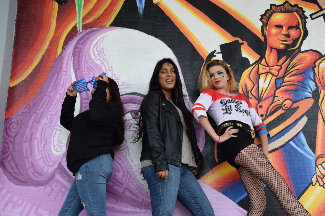
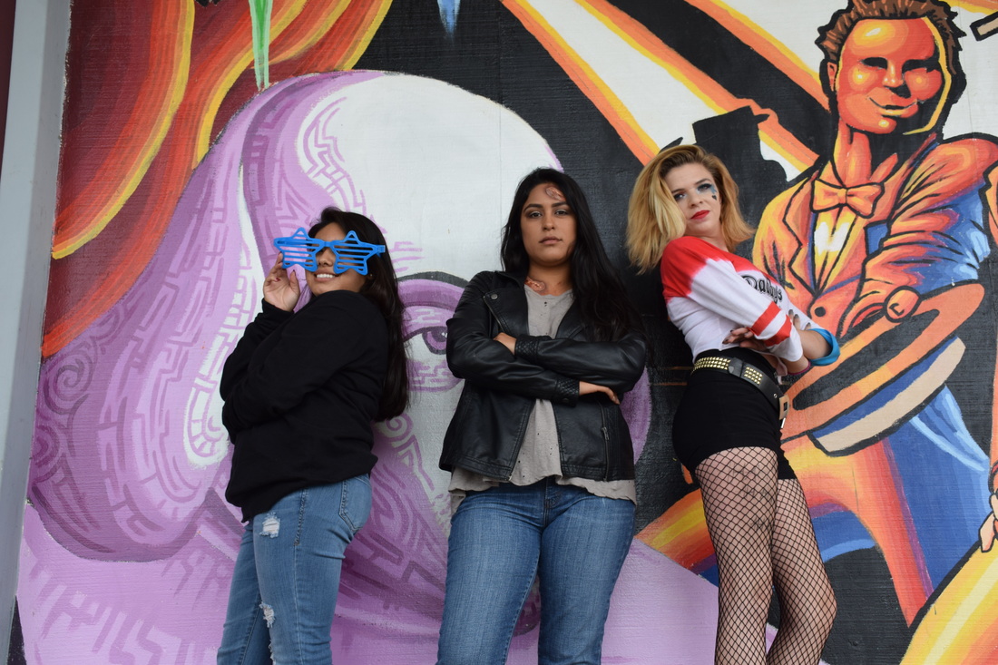
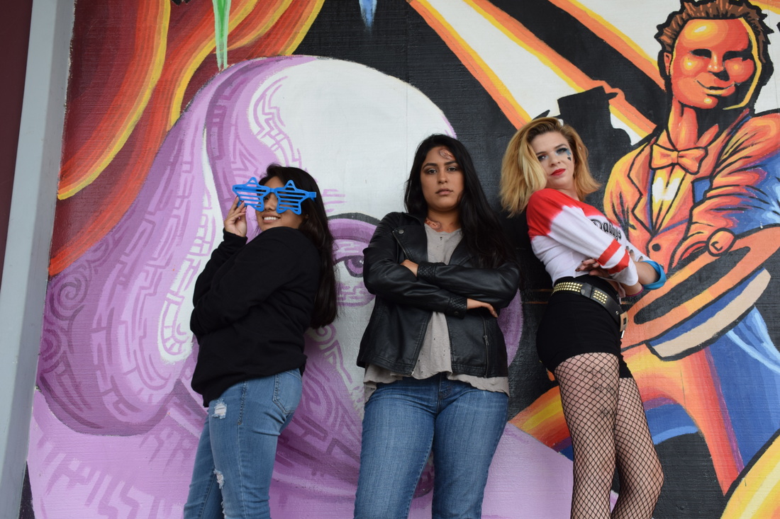
Expressions
Composite Photograph
Down To The River To Pray : Alison Krauss
As I went down in the river to pray
Studying about that good old way
And who shall wear the starry crown
Good Lord, show me the way!
O sisters, let's go down,
Let's go down, come on down
O sisters, let's go down
Down in the river to pray
As I went down in the river to pray
Studying about that good old way
And who shall wear the robe and crown
Good Lord, show me the way!
O brothers, let's go down
Let's go down, come on down
Come on, brothers, let's go down
Down in the river to pray
As I went down in the river to pray
Studying about that good old way
And who shall wear the starry crown
Good Lord, show me the way!
O fathers, let's go down
Let's go down, come on down
O fathers, let's go down
Down in the river to pray
As I went down in the river to pray
Studying about that good old way
And who shall wear the robe and crown
Good Lord, show me the way!
O mothers, let's go down
Let's go down; don't you want to go down?
Come on, mothers, let's go down
Down in the river to pray
As I went down in the river to pray
Studying about that good old way
And who shall wear the starry crown
Good Lord, show me the way!
O sinners, let's go down
Let's go down, come on down
O sinners, let's go down
Down in the river to pray
As I went down in the river to pray
Studying about that good old way
And who shall wear the robe and crown
Good Lord, show me the way!
As I went down in the river to pray
Studying about that good old way
And who shall wear the starry crown
Good Lord, show me the way!
O sisters, let's go down,
Let's go down, come on down
O sisters, let's go down
Down in the river to pray
As I went down in the river to pray
Studying about that good old way
And who shall wear the robe and crown
Good Lord, show me the way!
O brothers, let's go down
Let's go down, come on down
Come on, brothers, let's go down
Down in the river to pray
As I went down in the river to pray
Studying about that good old way
And who shall wear the starry crown
Good Lord, show me the way!
O fathers, let's go down
Let's go down, come on down
O fathers, let's go down
Down in the river to pray
As I went down in the river to pray
Studying about that good old way
And who shall wear the robe and crown
Good Lord, show me the way!
O mothers, let's go down
Let's go down; don't you want to go down?
Come on, mothers, let's go down
Down in the river to pray
As I went down in the river to pray
Studying about that good old way
And who shall wear the starry crown
Good Lord, show me the way!
O sinners, let's go down
Let's go down, come on down
O sinners, let's go down
Down in the river to pray
As I went down in the river to pray
Studying about that good old way
And who shall wear the robe and crown
Good Lord, show me the way!
Steps I took to create this image:
The first step I took to create this was I put a background image and I used a photo of a small river. I then made a layer mask to put the image of the bridge and made it to fit in the space properly. There was already water in front of the brigade but then I added a photo with ducks and grass around it using another layer mask. Next I had to add more grass on the left side so that it would cover the water from the very first image so I put an image that was only the grass and used the paint brush to remove as much as necessary. Finally i added the ducks on the side of the pond again using the paint brush tool to revoke what i need to and I also changed the color of the dirt under the ducks to make it more of the ground color in the background color.
The first step I took to create this was I put a background image and I used a photo of a small river. I then made a layer mask to put the image of the bridge and made it to fit in the space properly. There was already water in front of the brigade but then I added a photo with ducks and grass around it using another layer mask. Next I had to add more grass on the left side so that it would cover the water from the very first image so I put an image that was only the grass and used the paint brush to remove as much as necessary. Finally i added the ducks on the side of the pond again using the paint brush tool to revoke what i need to and I also changed the color of the dirt under the ducks to make it more of the ground color in the background color.
Mandalas
In my words, a mandala is an image repeated in a circular motion. To create a mandala first you have to have an outline for it then choose an image and drag one triangle part of the outline to the image, choosing one specific part of the image. Next you copy and past that onto the mandala outline and fit that triangle part where you want it to be fitted. Then duplicate the image and put it in the next triangle over and merge those two layers, repeat the step of duplicating the layers and then you will have have of the square. Finally you merge those two layers and duplicate that half and flip vertical opt horizontal, however you need it, to fit the other half and merge visible. Just like for the tessellations, I liked that you could take a very simple image and turn it into a very creative one. My favorite image that I created was the last one, which is water drops that were on the ground. I struggled with merging the layer rather than the visible because when I merged the visible and tried to move the duplicated layer, even the background was part of it. Something I would change if I did this project again would be making a better background for each mandala.
Tessellations
In my words, tessellations are images mirrored and those mirrored images being repeated. The first step of creating a tessellation is getting an outline of how a tessellation is. Then you choose an image and put part of it in one of the squares of the outline. Then you duplicate the picture and moving it the another square and either flip it horizontal or vertical, whatever is needed for the particular square. Repeat the last two steps till the outline is full. The thing that I liked about this i s that you have a plain image and create something completely different and way more creative. My favorite image that I created was the one with the cactus. At first I struggled with which way each image is supposed to be in the tessellation. If I did the project agin I would choose images with more color.
Portraiture
Aperture f/8, Shutter Speed 1/500, ISO 400
Aperture f/8, Shutter Speed 1/750, ISO 400
Aperture f/8, Shutter Speed 1/750, ISO 400
Aperture f/8, Shutter Speed 1/350, ISO 400
Aperture f/8, Shutter Speed 1/750, ISO 400
Aperture f/8, Shutter Speed 1/750, ISO 400
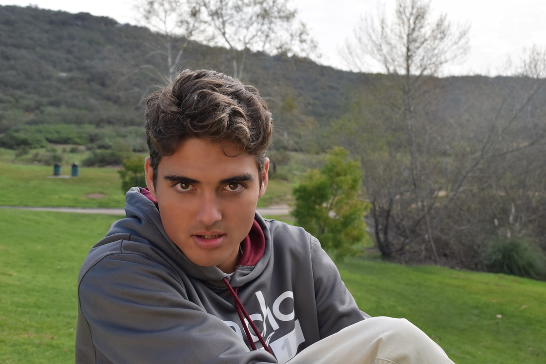
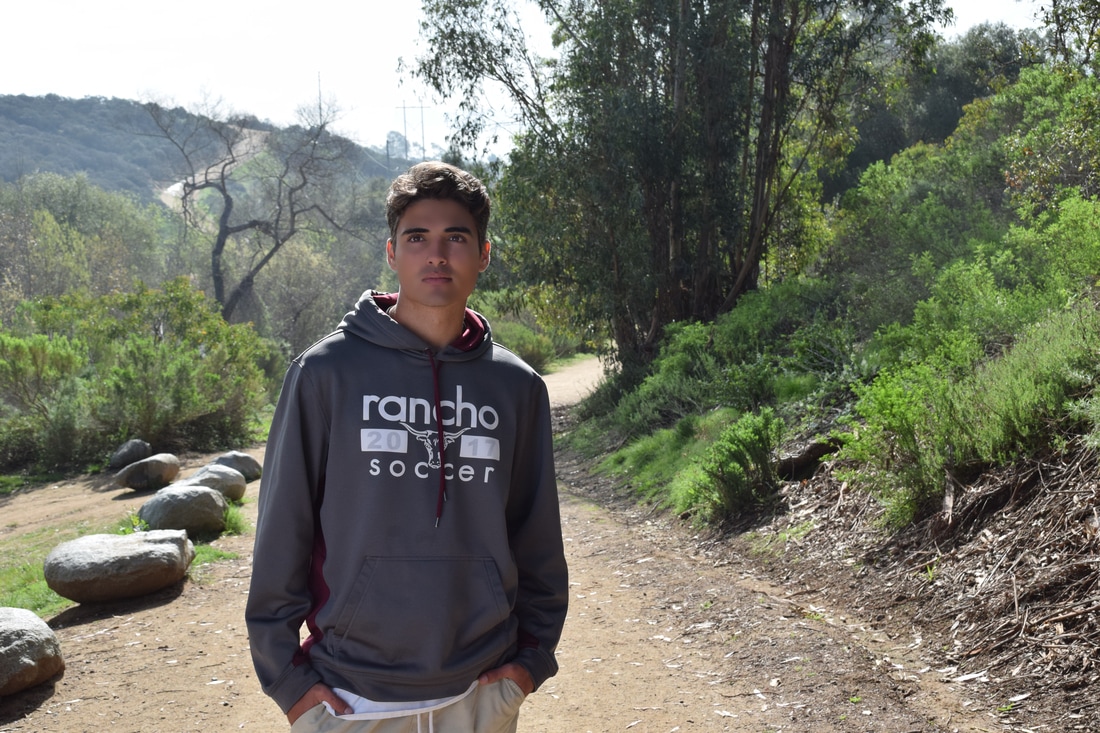
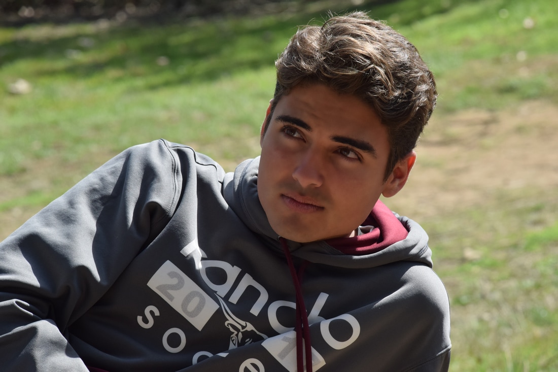
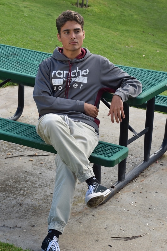
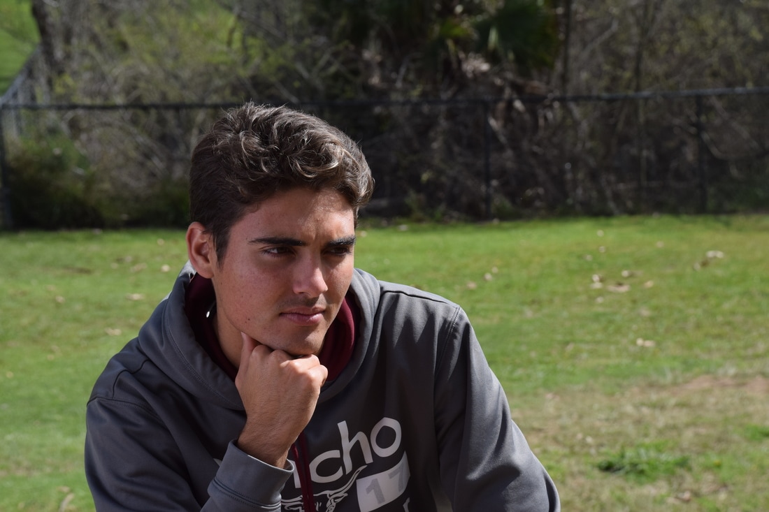
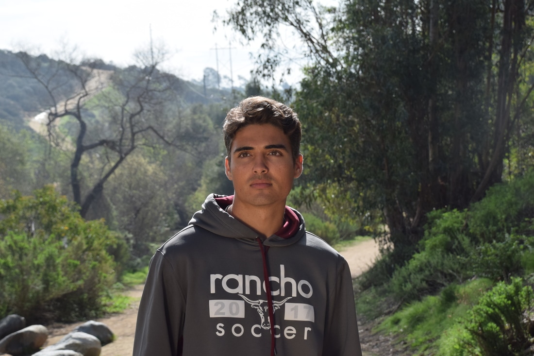
From going to the duck pond I learned that when a person takes portrait pictures, the background needs to be settle so that the main focus of the photo is the actual person. I used examples given to me for choosing the poses, which was very helpful. I did use the reflector which created a more glowing look but at the same time more settle look. To retouch the photos I used photoshop and the first step was to outline the part I wasted to retouch, then I had to make that place have more of a smooth look. After that I went over the places that I didn't want to be smoothed out which was the eyes, eyebrows, and lips. Finally I created noise at the end so that the picture was complete. Some positions that portrait photography uses are standing with hands in pockets or laying down with your feet towards the sky. The salary range for portrait photographers is 30,000. The average charge for portrait photos is $50 to $100 but could be raised for photo prints and digital prints.
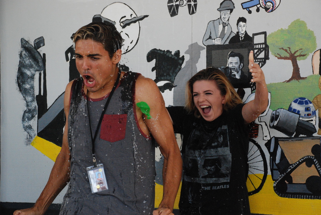
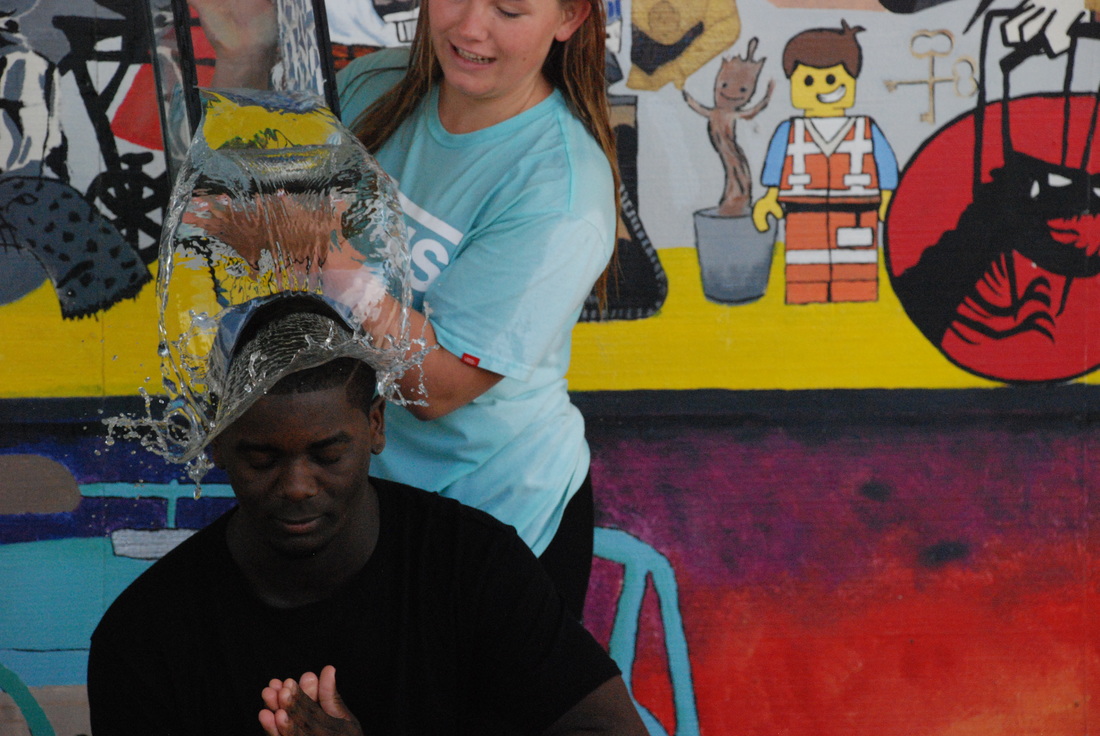
Education for all
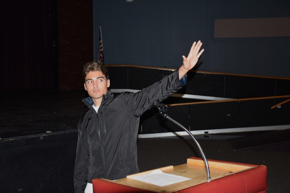
This photo represents education by this college student giving a speech about his success in life with education. He is holding up his hand to tell the students to stop and think about how their life at this moment and how it could all change just by having success in school. He says how there are many successes that connect to education. One being a career, another is living your dream. There is nothing stopping anyone as long as you try your best to succeed in what you would like to succeed in. Always keep pushing until you have reached your one and only goal in life, whether it is having the best business ever or having outstanding volunteer work.
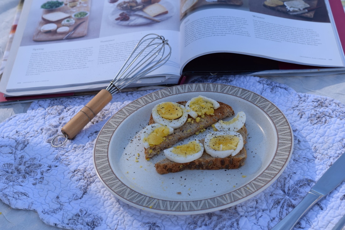
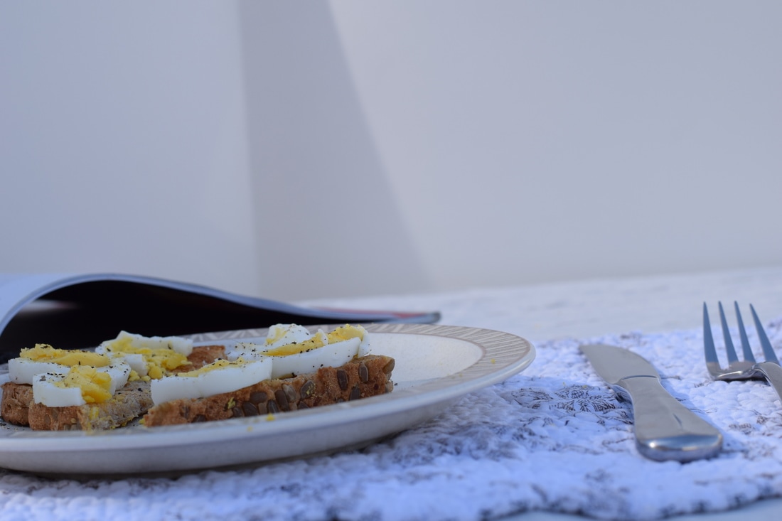
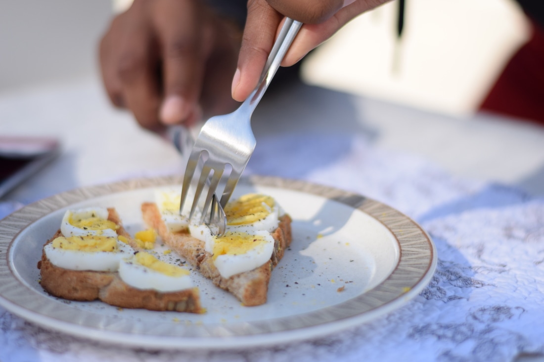
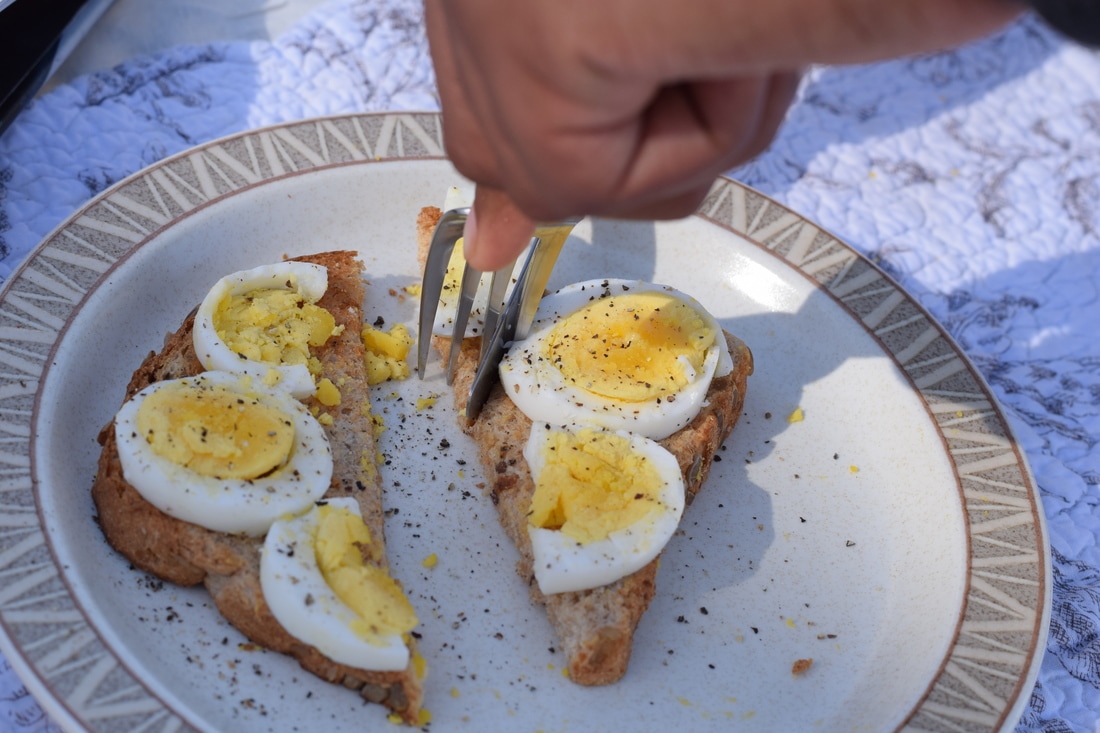
Food Photography
Aperture f/8, Shutter Speed 1/500, ISO 320
Aperture f/8, Shutter Speed 1/750, ISO 320
Aperture f/8, Shutter Speed 1/500, ISO 320
Aperture f/1.8, Shutter Speed 1/4,000, ISO 320
Aperture f/8, Shutter Speed 1/350, ISO 320
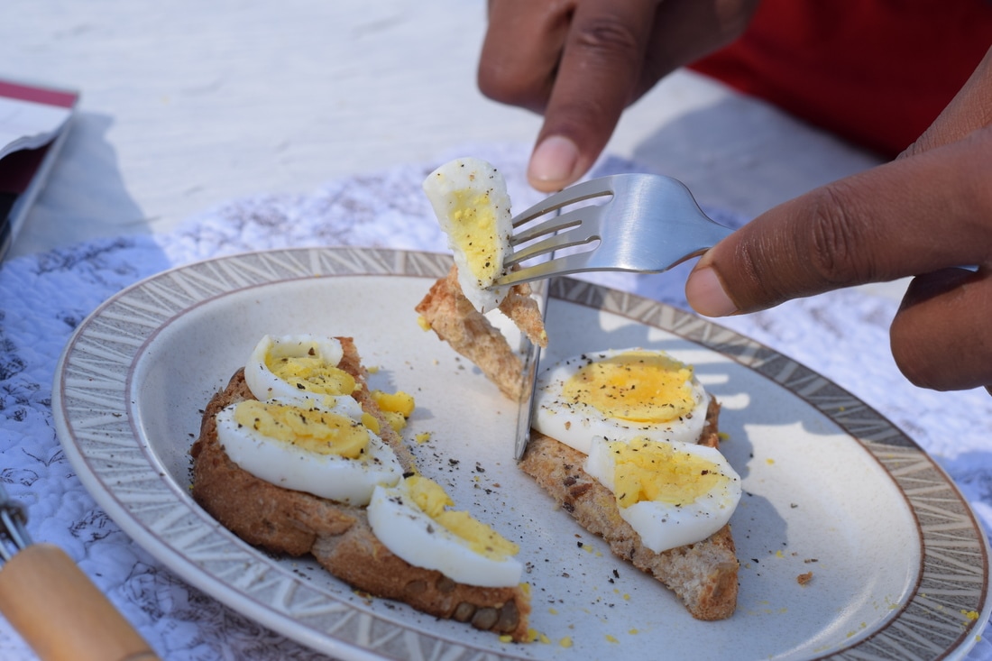
Aperture f/8, Shutter Speed 1/350, ISO 320
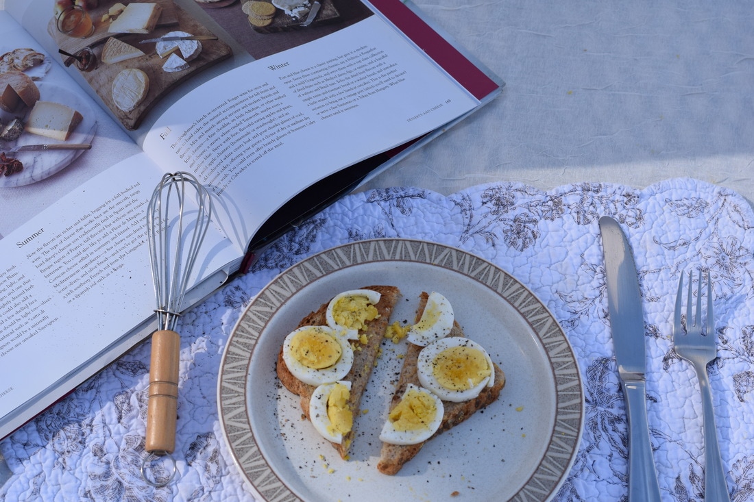
1. The food that I brought for this project was hard boiled eggs and toast. Props that i used were: a place mat, fork and knife, a plate, and a cookbook
2. Five things I learned about food photography from the video and presentation are there's specific people that set the food being photographed, things that aren't actually food are substituted, like they could use glue instead of milk, the food in commercials is the actually food from the restaurant but each part is specifically picked, the best lighting is natural light, and the photographs look a lot better with props added ins tread of just having for and nothing else surrounding it.
3. To make my photographs similar to the one online I cut the bread and eggs the same way as the photo as well as doing the same angle with the camera when taking the photos.
4. Three things I learned from actually doing the project are that different angles can show complete different parts of the food, natural-light gives the best lighting, and it takes time to get set and ready for the photographer to actually take the photos.
5. Businesses that use food photography are restaurants or cafes.
6. A success I had in this project was making the photographs look very similar to the one I found online. I think this is something I would not do again because I didn't enjoy it that much since it is a slow process and I like things in action.
Name Project
The first step I did to create this photo is get a template that had already been made for me and dragged it into photoshop. Then for each photo I made it black and white then dragged each individual photo into the template, pressing the check after each time after putting one in, enabling it for me to drag another in. Finally saved the photo, when I was done, in photoshop as well as a jpeg. The part I struggled the most was knowing to click check before I was able to put another photo in the template. I was proud of myself for finding each letter in natural things and the letters actually being visible to not only me. The thing I like the most about my project is that each letter is completely different. I think I could have done better by doing my first name and being more creative with it because I kind of took the "easy way out".
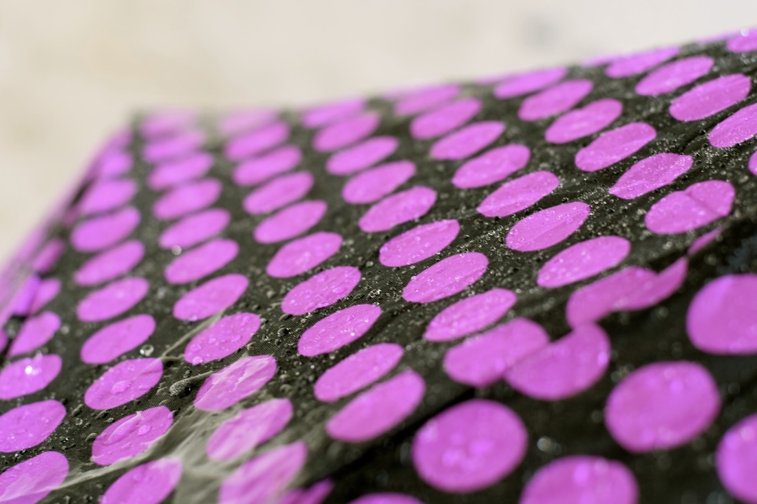
Rainy Day
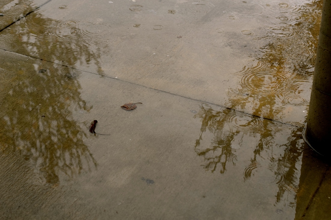
Aperture f/4, Shutter Speed 1/500, ISO 640
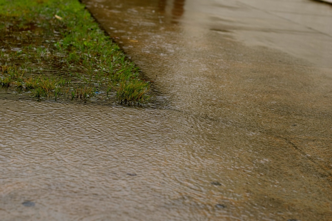
Aperture f/4, Shutter Speed 1/1,000, ISO 640
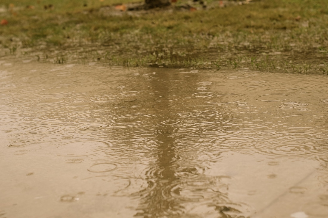
Aperture f/4, Shutter Speed 1/1,000. ISO 640
Aperture f/4, Shutter Speed 1/45, ISO 640
Layermask
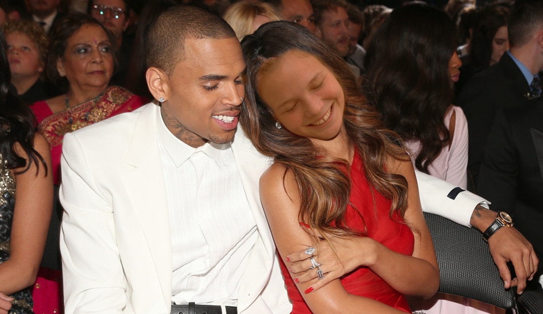
This image has me has Rihanna with Chris Brown. I believe this is at some sort of reward event. I chose this photo because I love both Chris Brown's and Rihanna's music so I thought it would be fun to do this project with an image of them together.
HDR Procedure
Artist as Mentor
Presentation on Travis Burke by Nakiya Bird docs.google.com/presentation/d/16kTh3Q27_N4kMS2Bt6OeuOuCxDRQsw7F9G7XOHfESiI/edit?usp=sharing
Moon Photography
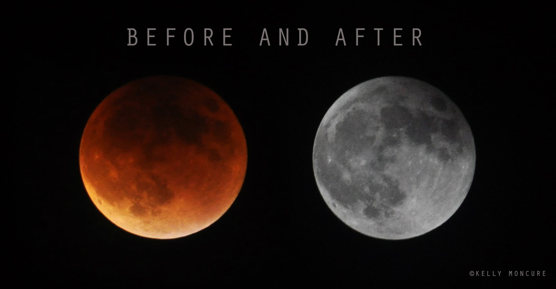
Blood Moon Lunar Eclipse, September 27, 2015. Left image: 70-300mm lens @ 270mm, ISO 1000, aperture f/5.3, shutter speed 1.3 secs. Right image: 70-300mm lens @ 300mm, ISO 800, aperture f/13, shutter speed 1/1250 sec.
To photograph the moon:
1. Use a tripod! A flat surface will only allow you to shoot straight, and shooting the moon means that you'll be shooting up and constantly re-adjusting the tripod as the moon moves throughout the night.
2. Use a shutter release cord, remote or the camera's self timer if you don't have one, so that you don't move the camera when pressing the shutter release during a long exposure.
3. Use a zoom lens and zoom in as much as you can to the moon. It's okay if it's not a super fancy lens, this was shot using a 15 year old $100 lens. Focus in on the craters and details on the moon.
4. ISO 1250- 1600, so that you can use as fast a shutter speed as you can without losing detail-the longer the shutter speed, the more chances you have the camera will shake even slightly in the wind, resulting in an out of focus photograph.
5. Aperture priority of f/5.6 since you are not worried about capturing any details other then the moon.
6. Bracket your exposure, meaning over expose and underexpose the photograph from what the camera is telling you. Generally the camera will overexpose the moon, so you'll get nothing but a white blob in the sky. Use the exposure compensation button (the +/- button below the shutter release) and change the exposure to -0.5, then -1.0, then -1.5 and so on, until you start seeing detail in the moon. You may go as far as -5.0 exposure compensation to get what you need.
7. Take a fair amount of photos and keep refocusing as the night progresses. The photographs may look focused on the camera's display, but you won't really see if they're completely in focus until you upload them onto your computer screen.
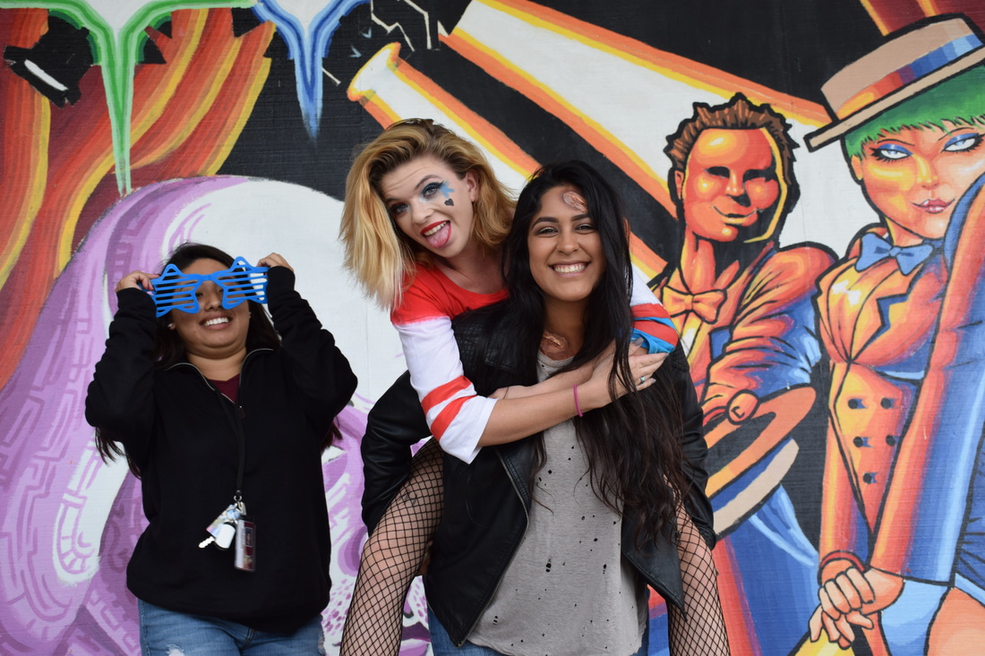
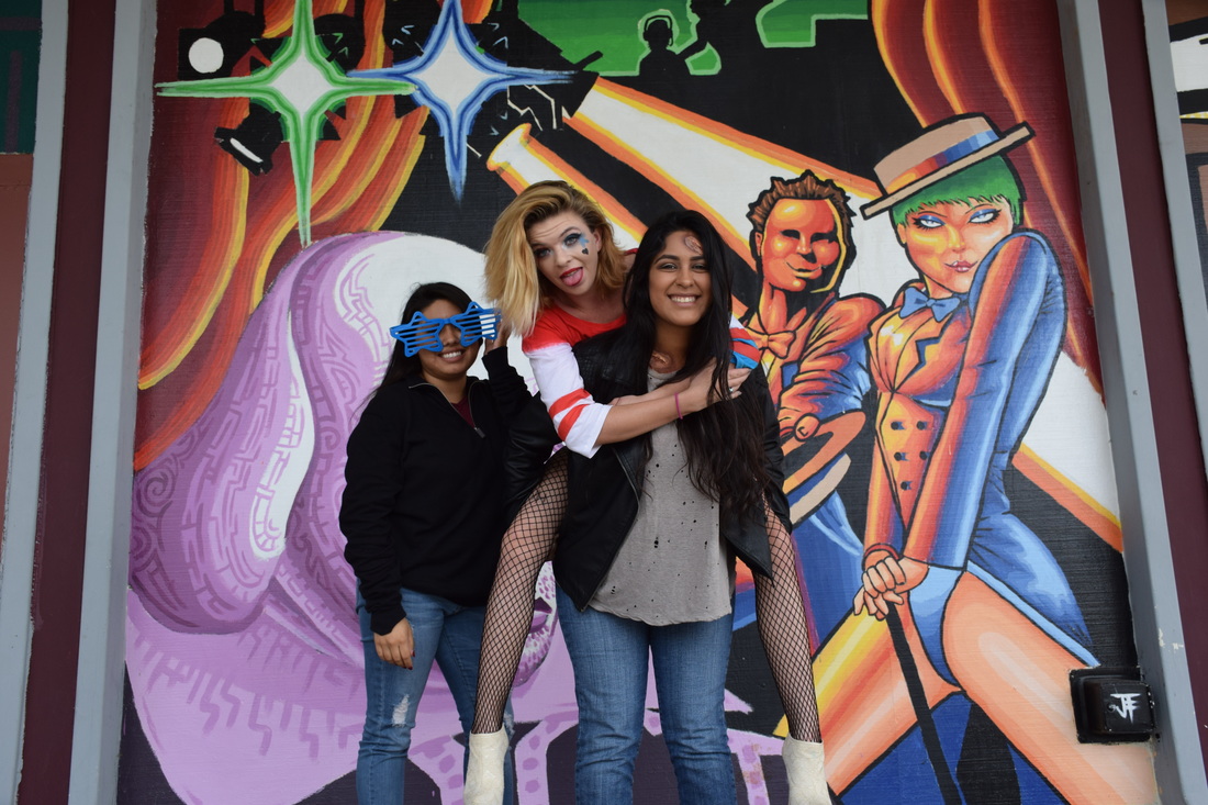
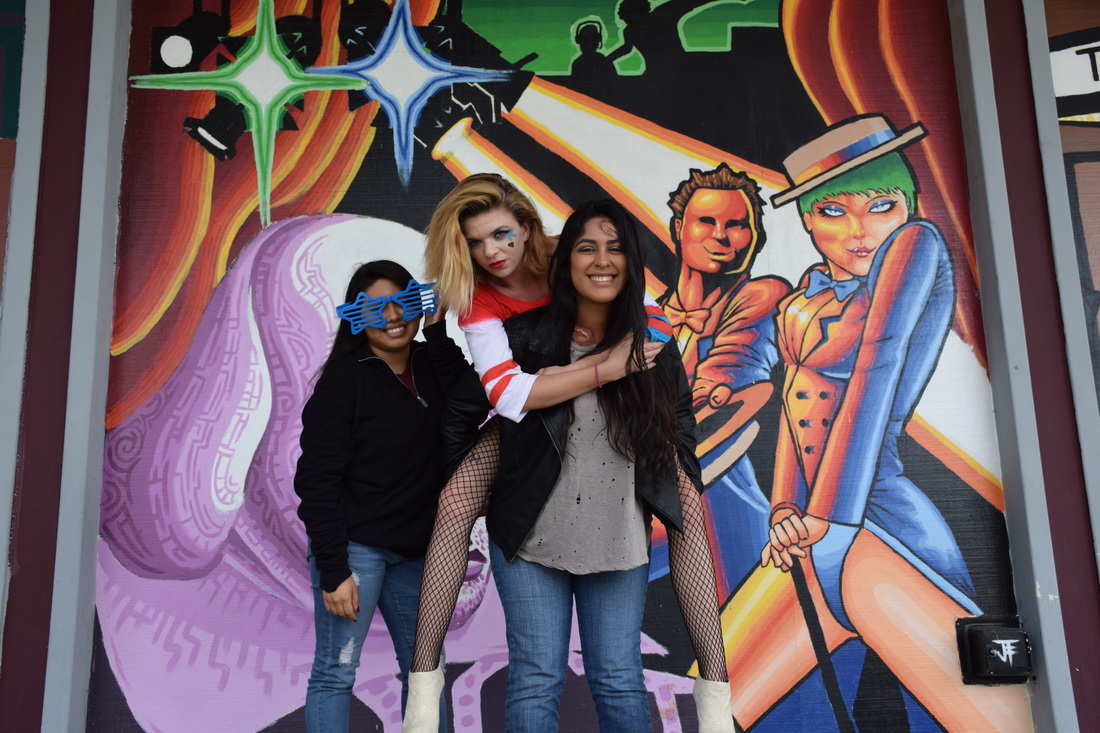
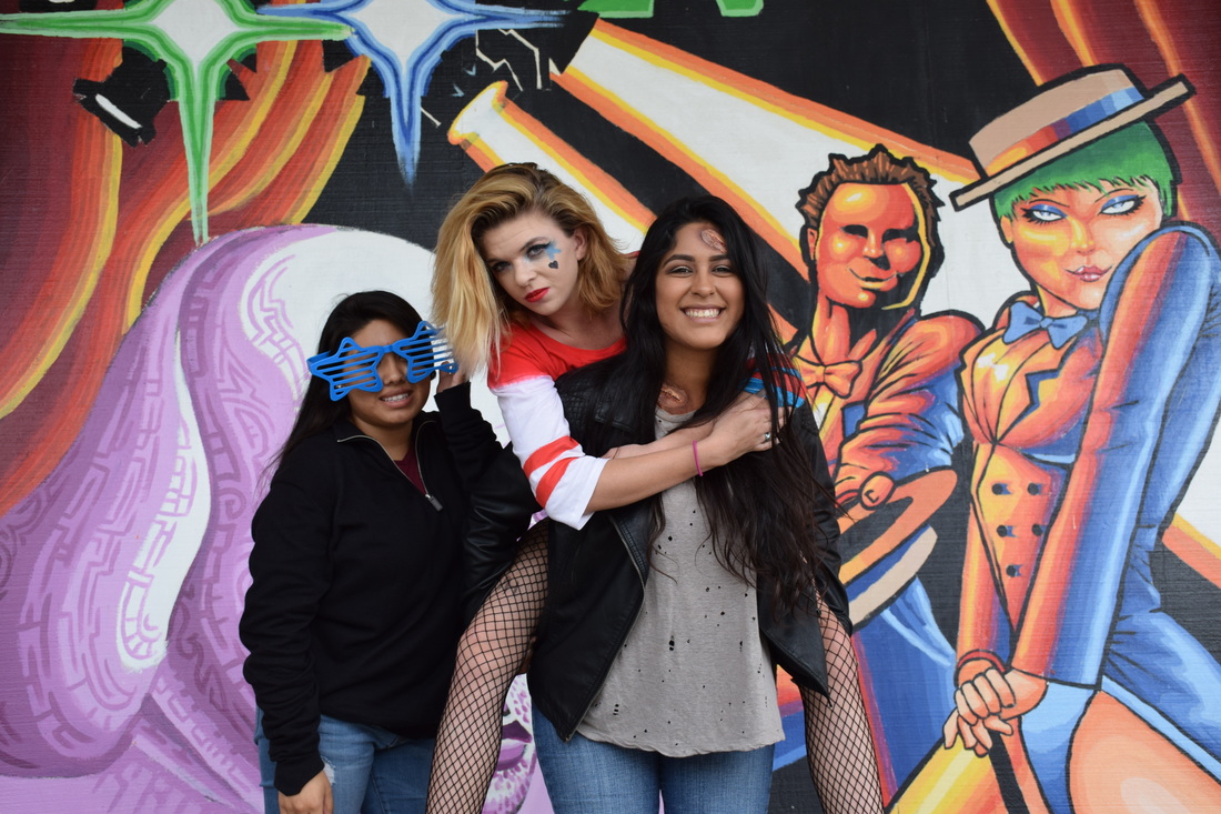
Halloween
Aperture f/8, Shutter Speed 1/200, ISO 400
Aperture f/8, Shutter Speed 1/250, ISO 400
Aperture f/8, Shutter Speed 1/250, ISO 400
Aperture f/8, Shutter Speed 1/200, ISO 400
Aperture f/8, Shutter Speed 1/200, ISO 400
Aperture f/8, Shutter Speed 1/200, ISO 400
Aperture f/8, Shutter Speed 1/200, ISO 400
Aperture f/8, Shutter Speed 1/200, ISO 400
Aperture f/8, Shutter Speed 1/200, ISO 400
Principles of Art
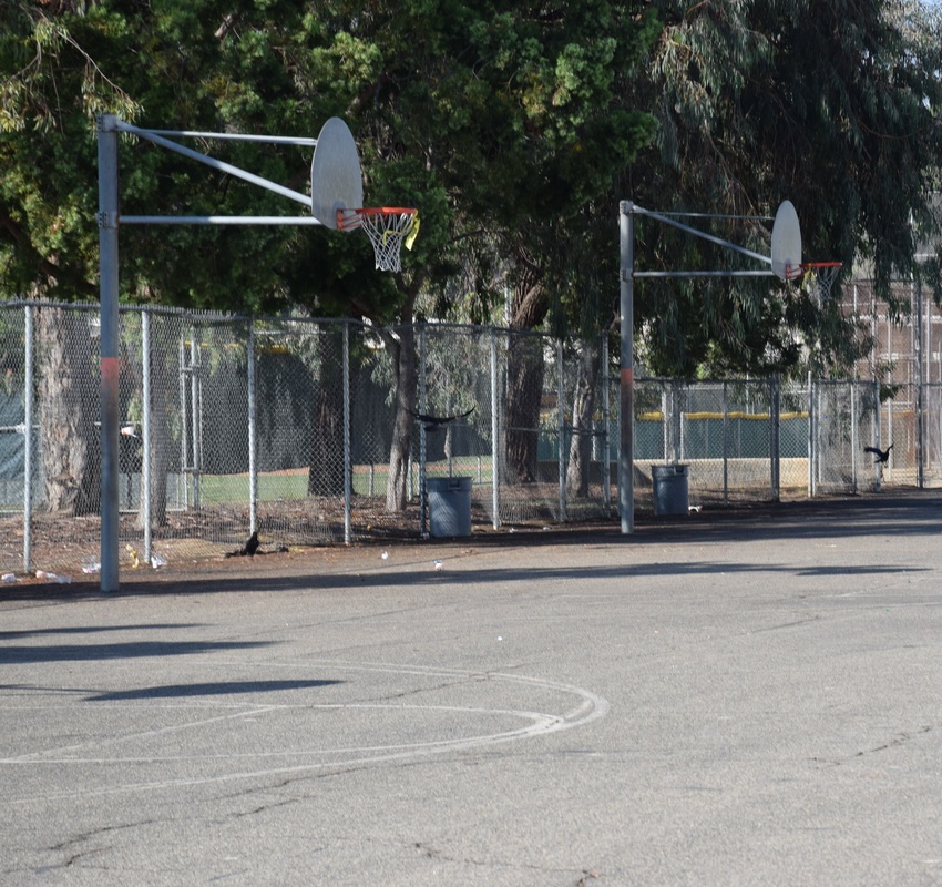
Balance: Aperture f/8, Shutter Speed 1/640, ISO 400
This image shows balance because there are the two basketball hoops next too each which makes it have equal sides.
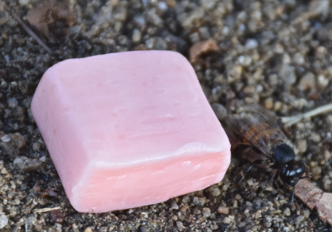
Proportion: Aperture f/8, Shutter Speed 1/160, ISO 400
This image shows proportion because the candy is much bigger compared to the bee.
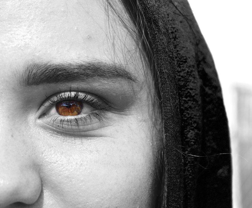
Emphasis: Aperture f/8, Shutter Speed 1/1,250, ISO 400
This photo shows emphasis by having all of the picture black or white except for the color of the persons' eye.
Harmony: Aperture f/8, Shutter Speed 1/400, ISO 400
This photo shows harmony by the whole picture having the same color throughput the whole photo.
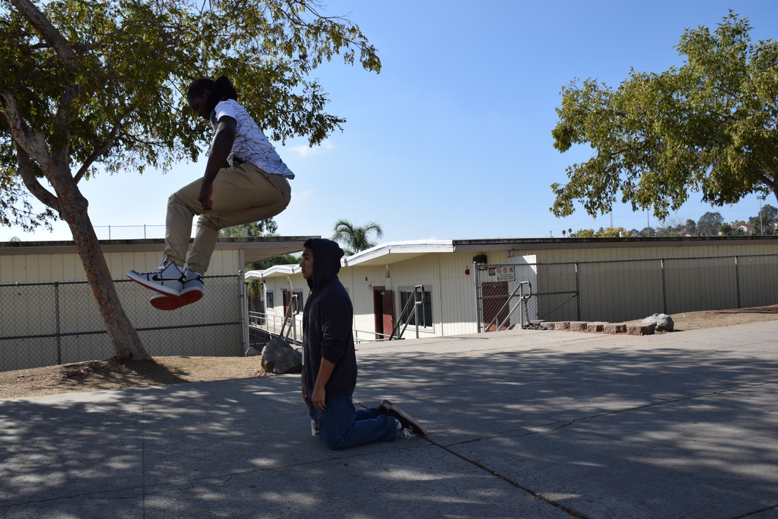
Variety: Aperture f/8, Shutter Speed 1/1,250, ISO 400
This photo shows variety because Jaleel is jumping very high over Tommy, which is interesting.
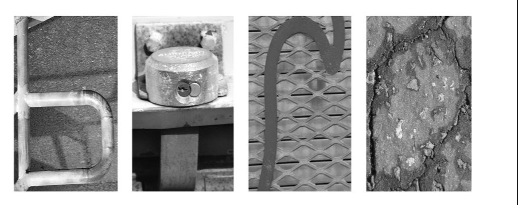
Elements of Art
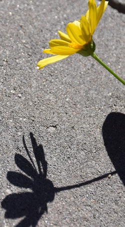
Value: Aperture f/8, Shutter Speed 1/1,250, ISO 400
This photo shows value because the background is grey and then the flower is contrasted with it.
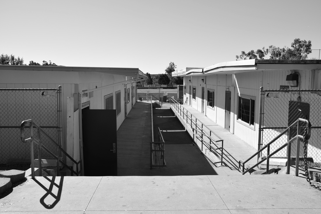
Space: Aperture f/8, Shutter Speed 1/1,000, ISO 400
This photo shows space because there is the large space between the two buildings.
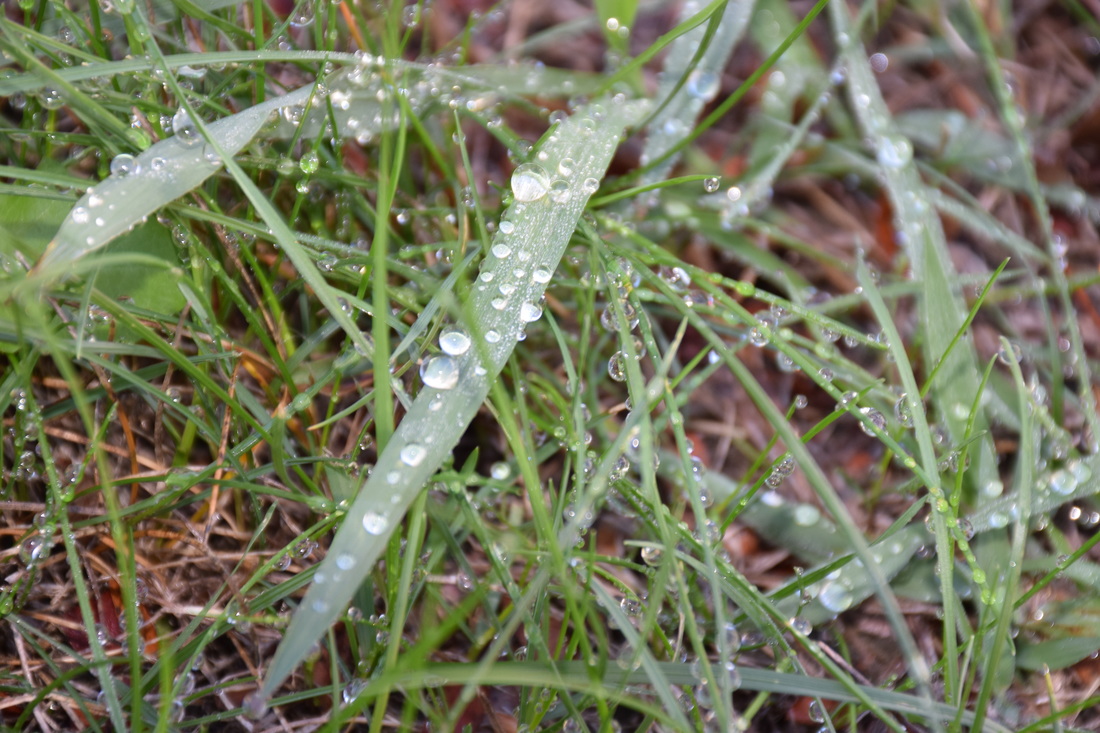
Texture: Aperture f/8, Shutter Speed 1/60, ISO 400
This photo shows texture because you can see the dew/water on the grass.
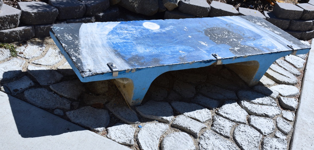
Form: Aperture f/8, Shutter Speed 1/1,000, ISO 400
This photo shows form because you can see theta the bench is three dimensional by the shadow being ion the ground.
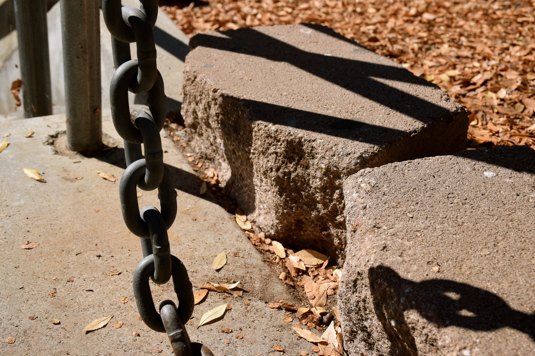
Shape: Aperture f/8, Shutter Speed 1/1,250, ISO 400
This photo shows shape by having the chain and the ovals on it and also the blocks of cement are quadrilateral.
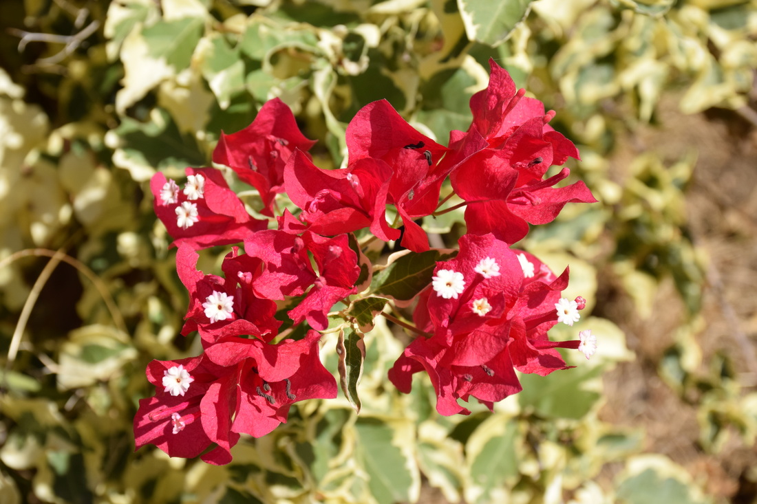
Color: Aperture f/8, Shutter Speed 1/1,250, ISO 400
This photo shows color by having the background having a light green but then there is the pop of pink/red from the flowers.
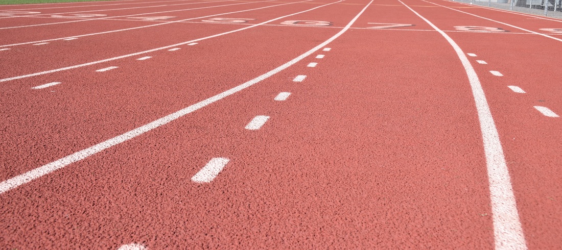
Line: Aperture f/8, Shutter Speed, 1/1,000, ISO 400
This photo shows line by the track having the lines on it.
Elements and Principles
Balance :
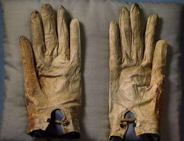
Annie Leibovuitz, Pilgrimage, 2012
file:///Users/265004323/Desktop/licolngloves.0.jpeg
Value :
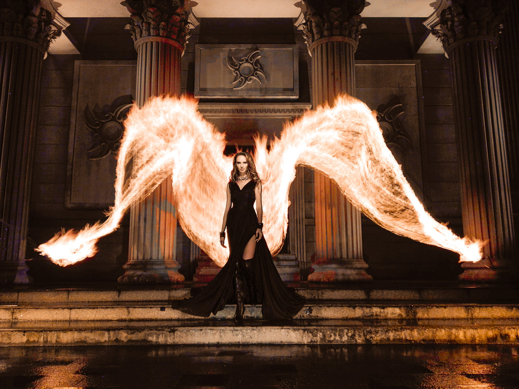
Ben Von Wong, Fire Angel, 2015
http://www.vonwong.com
Space :
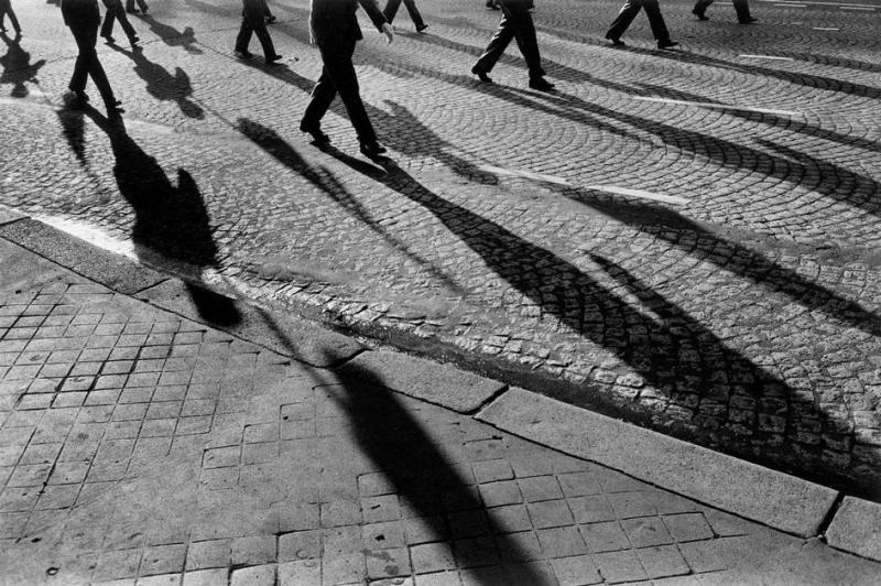
Josef Koudelka, France. Paris, 1980
http://erickimphotography.com/blog/2014/12/04/book-review-exiles-josef-koudelka/
Texture :
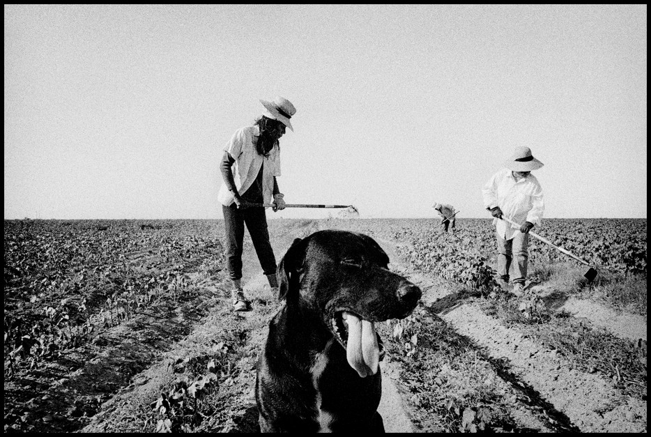
Matt Black, Weeding Cotton, 2001
http://pro.magnumphotos.com/C.aspx?VP3=CMS3&VF=MAGO31_10_VForm&ERID=2K1HRG66U2T0
Form :
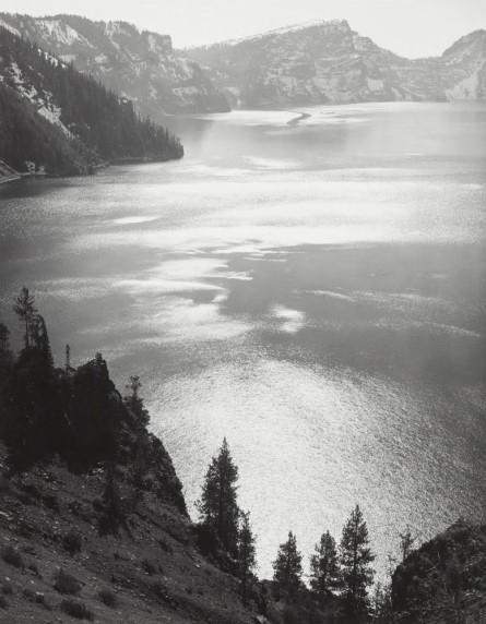
Ansel Adams, Afternoon Sun, 1943
http://shop.anseladams.com/Afternoon_Sun_Crater_Lake_National_Park_1943_p/1701002103.ht
Shape :
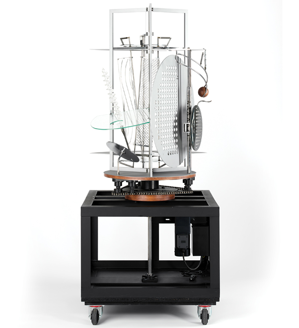
Laszlo Moholy, Light Prop for an Electric Stage, 1929-1930
http://www.tate.org.uk/research/publications/tate-papers/08/replicas-of-laszlo-moholy-nagys-light-prop-busch-reisinger-museum-and-harvard-university-art-museums
Color :
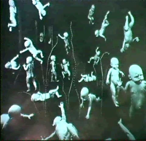
Sandy Skoglund, Maybe Babies, 1983
http://sandyskoglund.com/pages/imagelist/1280_960/79_84/index.html
Line :
Alfred Stieglitz,
The Hand of Man,
1902
http://www.metmuseum.org/art/collection/search/269461
Elements of Art
- The “building block” design
- All good design will have one or more of these elements: line, color, shape, texture, form, space, and value
- One-dimensional and can vary in width, direction, and length
- Lines can be horizontal, vertical, or diagonal, straight, or curved, thick or thin
- Lines lead the eyes of a person around the composition
- Three main characteristics: hue (red,yellow, green), value (how light or dark), intensity (how bright or dull it is)
- Also described as warm (red or yellow), cool (blue or green)
- Monochromatic- one color plus its tints (adding white) and shades (adding black)
- Complimentary colors- colors opposite each other on the color wheel
- Analogous colors- colors next to each other on the color wheel
- Two-dimensional, with a height and width
- Organic shape- a shape made by nature
- Not completely defined
- Inorganic shape- manmade-such as triangles and rectangles
- Three dimensional, has height, width, and depth
- Emphasize form by the use of highlights and shadows
- All objects have a physical texture (Horse- hair, Dolphin- smooth)
- Two dimensional work- texture gives a visual sense of how an object depicted would fell in real life in touched
- Three dimensional
- Feeling of depth or three dimensions
- Use of the area around the picture plane
- Positive Space- space occupied by the primary object
- Negative space- space around the primary object
- Lightness or darkness of a surface
- Frequently used when talking about shading, but it also important in the study of color
- The rules or guidelines of art
- Used to organize or arrange the structural elements of design
- Principles- balance, proportion, rhythm, emphasis, harmony, variety, and unity
- Similar to our physical sense of balance
- How the artist uses opposing forces in a composition that results in visual stability
- Successful compositions achieve balance in one of two ways: symmetrically or asymmetrically
- Relates to the relative size and scale of the various elements in a design
- The relationship between the objects
- An artwork indicates movement by the repetition of elements
- Can make artwork seem active
- To make one part of an artwork dominant over the other parts
- Attracts the viewer’s eyes to a place of special importance in an artwork
- Pleasing quality achieved by different elements of a composition interacting to form a whole
- Often accomplished through repetition of the same or similar characteristics
- Differences achieved by opposing, contrasting, changing, elaborating, or diversifying elements in a composition to add individualism and interest
- The result of bringing the elements of art into the appropriate ratio between harmony and variety to achieve a sense of oneness
- It is the sense that everything works together and looks like it fits
Respect Project
Aperture f/32, Shutter Speed 50 of a Second, ISO 200
Shutter Speed Exercise
Aperture f/5.6, Shutter Speed 1,000 of a Second, ISO 1600
Aperture f/5.3, Shutter Speed 1,000 of a Second, ISO 1600
Aperture f/5.6, Shutter Speed 1,000 of a Second, ISO 1600
Aperture f/8, Shutter Speed 1,000 of a Second, ISO 1600
Aperture f/2, Shutter Speed 1,000 of a Second, ISO 100
Aperture f/4, Shutter Speed 250 of a Second, ISO 100
Aperture f/8, Shutter Speed 60 of a Second, ISO 100
Aperture f/10, Shutter Speed 30 of a Second, ISO 100
1. To change the shutter-priority, I changed the shutter speed to the one that was needed.
2. When the shutter speed was changed the photos were more and more visible with each time that the shutter speed went up since the picture was "taken" faster.
3. Situations you would use shutter speed as priority is in action pictures
Shutter Speed:
2. When the shutter speed was changed the photos were more and more visible with each time that the shutter speed went up since the picture was "taken" faster.
3. Situations you would use shutter speed as priority is in action pictures
Shutter Speed:
- a technical and aesthetic choice a photographer needs to make before releasing the shutter
- Shutter inside a camera controls the duration of time the sensor is exposed to light
- Fast shutter speed is often utilized to freeze the movement of a subject
- Slower shutter speed can be used to show motion and visualize movement
- Shutter speeds are expressed as seconds or fractions of seconds
- 1/8000, 1/4000,1/2000
- 1 second, 2 seconds, 3 seconds
- General rule to prevent unintentional camera shake you should avoid handholding your camera
- Using a tripod can help eliminate camera shake when using slower shutter speeds
- Visual blur and suggestion of a movement occurs because the subject is moving against a static background
- Layering motion of different subjects mcing different directions at different speeds can set up interesting dynamics with a photograph
- Fast shutter speed can make normal subjects appear to freeze in the air
- When photographing people running relatively close to the camera a shutter speed 1/1000 second or faster should freeze most motion
- The distance the subject is from the camera, the speed of the subject, and the focal length of the lens will affect whether the subject is sharp or blurred
- Slower shutter speed combined with panning can help isolate the subject from a busy and distracting background
- A tripod combined with a long exposure can capture the firework’s trails
- Water movement can be emphasized with long exposure
Daguerrotype and Cyanotype
Cyanotype:
1. The inventor of cyanotype was John Herschel. It was first discovered in 1842.
2. Chemicals that are used in a cyanotype are potassium ferricyanide and ferric ammonium citrate.
Daguerrotype:
1. The inventor of Daguerrotype was Nicephore Niepce and Louis Daguerre. This was discovered in 1814-1815.
2. The process of daguerrotype starts off with a silver-platted copper plate. The plate is buffed and polished which then creates it to look like a mirror. Then the plate is put in light over iodine and bromine in light proof boxes.
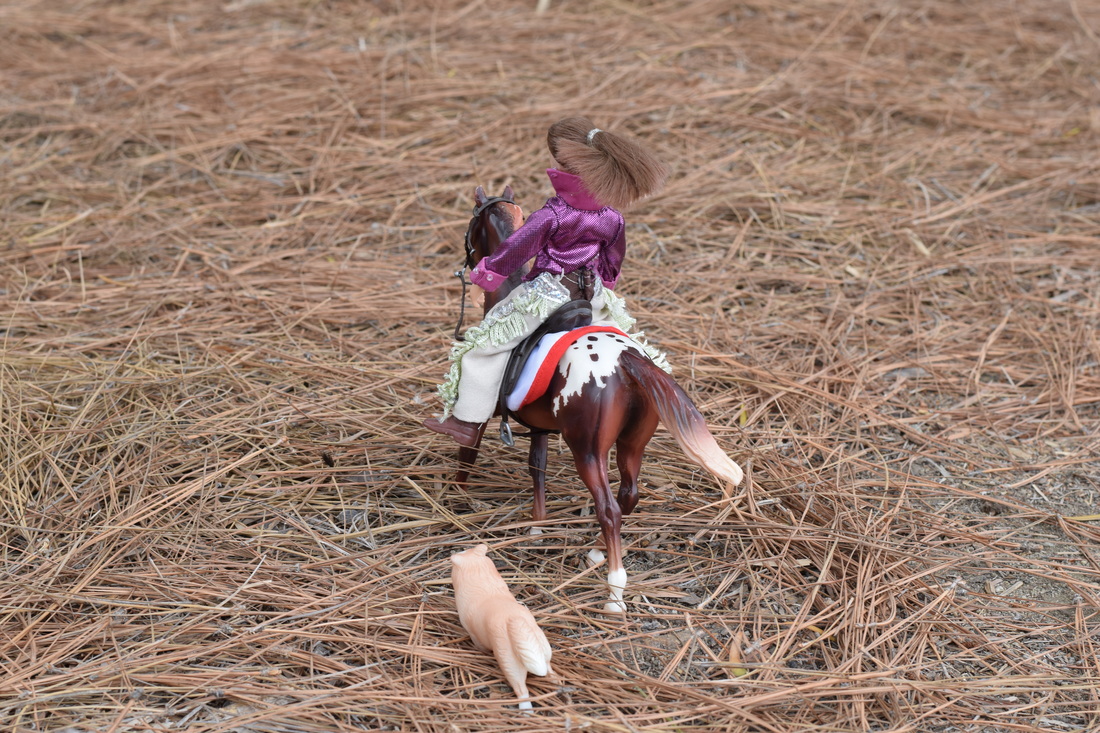
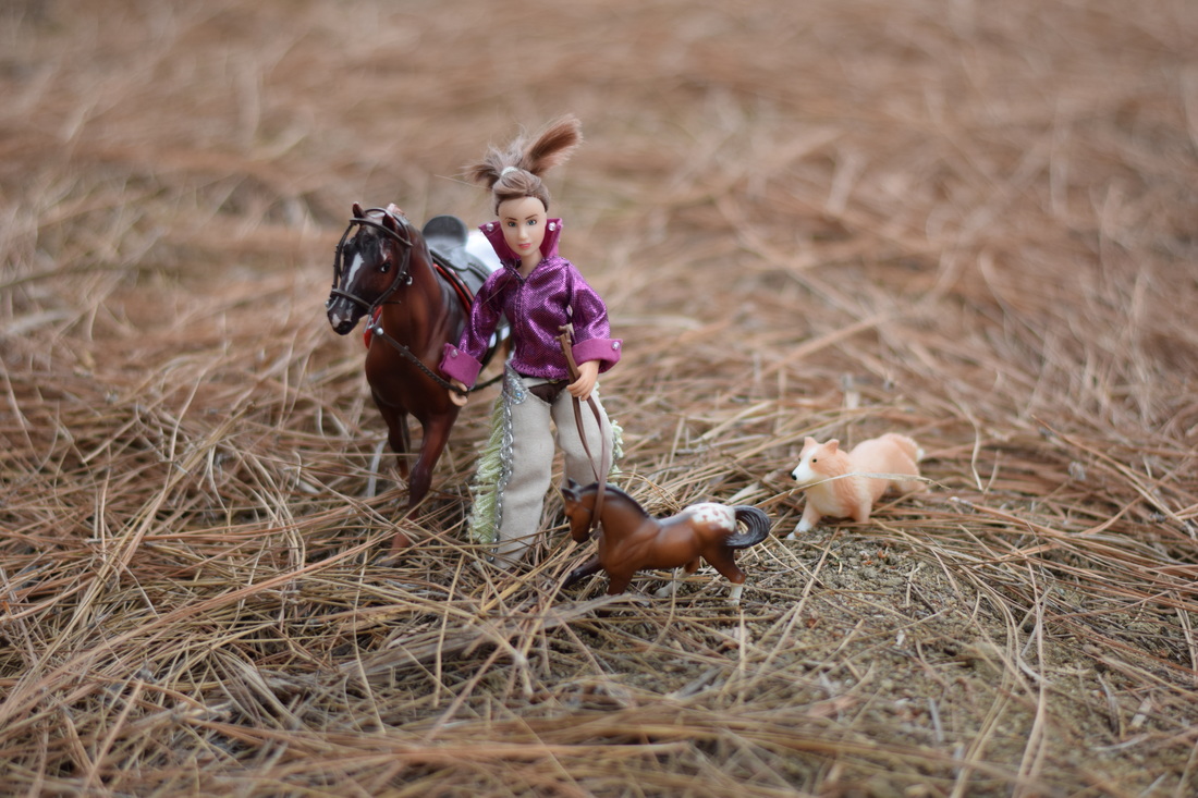
Toy Story- Bestfriends
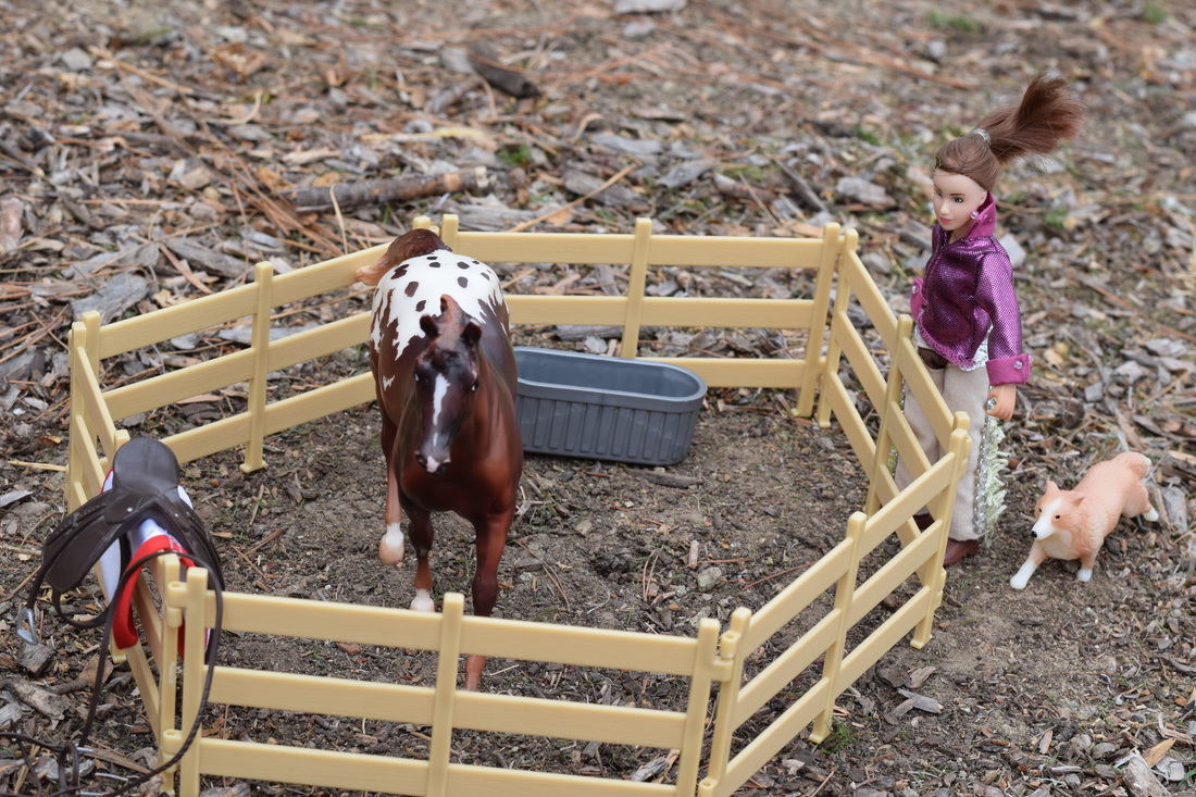
Aperture f/8, Shutter Speed 400 of a Second, ISO 400
Amy has just recovered from a broken leg so she wants to go for a ride with Sonora, her horse, and Sally, her dog. It's been a very long time they've gone out since Amy had been hurt for so long.
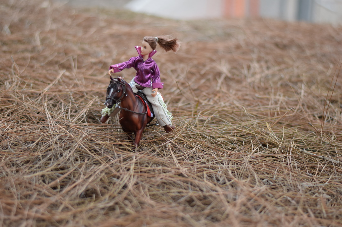
Aperture f/8, Shutter Speed 200 of a Second, ISO 400
Amy decided to go out in a large pasture to just wonder around and look at scenery. They had been looking around for a little while....
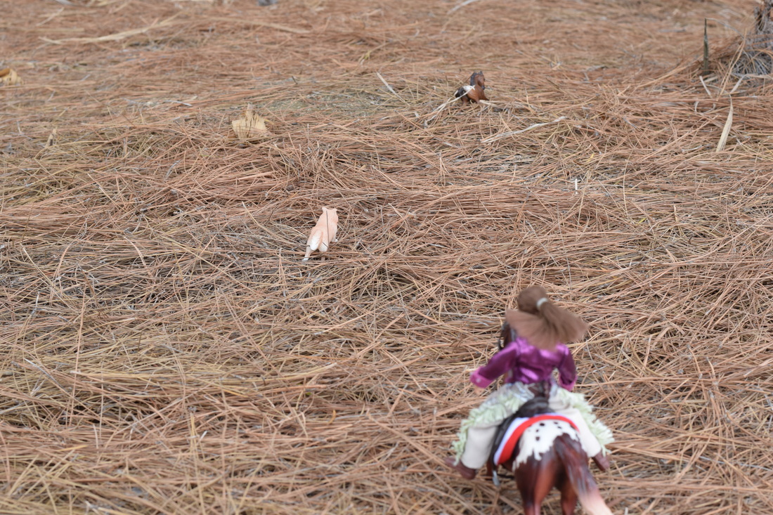
Aperture f/8, Shutter Speed 200 of a Second, ISO 400
All of a sudden Sally ran off away from Sonora and Amy. Then Sonora turned her head like she saw it too. In the distance Amy could see that there was a figure of some kind of animal.
Aperture f/ 1.8, Shutter Speed 4,000 of a Second, ISO 400
Amy then started to have Sonora run to where Sally was. It was far so it took her a while to get over to where Sally had ran and she didn't know if they would make it the whole way.
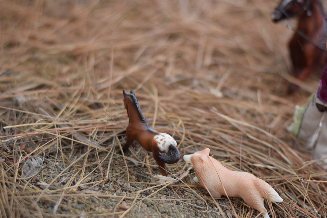
Aperture f/1.8, Shutter Speed 3,200 of a Second, ISO 400
When Amy and Sonora arrived there was a foal. It looked like it had just been born a couple months before. Amy didn't know if the foal was a wild one or one that had escaped but it didn't seem like it was wild because the foal was getting along with Sally.
Aperture f/1.8, Shutter Speed 1.400 of a Second, ISO 400
After a the foal had kind of gotten used to Sonora, Sally, and Amy, Amy put a halter on the foal and they all started to go back to the house. It took a long time because they had to walk all the way back and they were pretty far out in the pasture. Also it was difficult because the foal wasn't used to having a halter on.
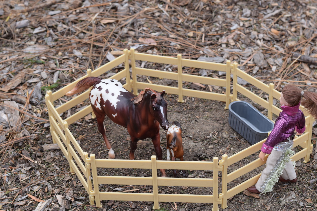
Aperture f/8, Shutter Speed 400 of a Second, IOS 400
They finally got back after about an hour and a half. Sonora and the foal, which was named Zeva, were put together in the cage. In the end Zeva and Sonora ended up being best friends
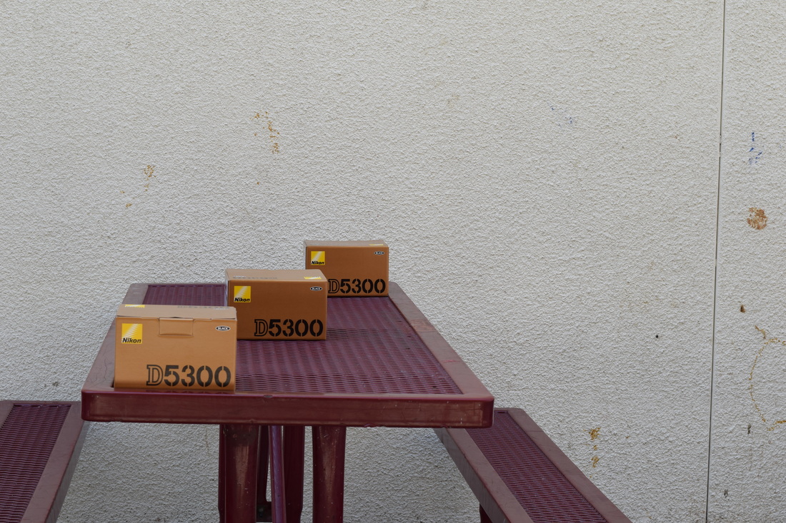
Aperture Priority
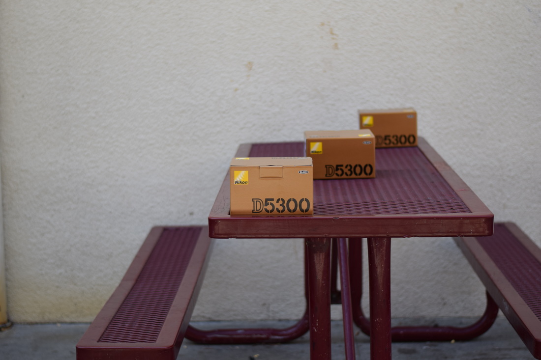
Aperture f/8, Shutter Speed 125 of a Second, ISO 200
Aperture f/8, Shutter Speed 125 of a Second, ISO 200
Aperture f/16, Shutter Speed 1/30 of a Second, ISO 200
Aperture controls the brightness in the depth of field. Depth of field helps blur out the background or make the whole picture clear. With aperture you can guide the view that people look at to the main point of the photo. The bigger number of "f" then the smaller the opening. Each smaller aperture lets in 1/2 more light than the aperture before. When selecting the aperture the camera will automatically change the exposure of the picture.
In the first photo with the aperture of f/ 1.8, the background is blurred out the most out of all the pictures. In the second photo with the aperture of f/8 the surroundings are not as blurred out but you can see which box the picture is focused on. Finally in the third photo with the aperture of f/16 it is the photo overall that is most focused for the whole picture, so the words/numbers are visible on all the boxes.
In the first photo with the aperture of f/ 1.8, the background is blurred out the most out of all the pictures. In the second photo with the aperture of f/8 the surroundings are not as blurred out but you can see which box the picture is focused on. Finally in the third photo with the aperture of f/16 it is the photo overall that is most focused for the whole picture, so the words/numbers are visible on all the boxes.
Digital Camera Basics
Digital Camera Basics:
DSLR
- Digital Single Lens Reflex: uses mirrors to direct light from the lens to the viewfinder, which is a hole on the back of the camera that you look through to see what you are taking a picture of
Exposure
- The amount of light collected by the sensor in your camera when you take
the picture
- if the shot is exposed too long the photograph with be washed out
-of the shot is exposed too short the photograph will appear too dark
-all camera today have light meters which measure the light in the given shot
And set an ideal exposure
-Three primary controls your camera uses for exposure are aperture, shutter
speed, and ISO
Aperture in a camera
- simply put, aperture is a hole within a lens
-Size of aperture: large versus small aperture
The bigger the f number, the wider the hole is, so if there is a f/22 the hole will be very very small. Use this for landscapes, it’s used for getting pictures back in focus.
Depth of Field
- the distance to which objects behind and in front of the focal point
appear to be in focus
Shutter Speed
- “exposure time”: stands for for length of time a camera shutter is open to
expose light into the camera sensor
-if the shutter speed is fast, it can help to freeze action completely
-if the shutter speed is slow, it can create an effect called “motion blur”,
where moving objects appear blurred along the direction of motion
How shutter speed are measured
- typically measured in fractions of second, when they are under a second
Rule of thumb for shutter speed
- the slowest shutter speed for handheld photography is 1/60, Anything
lower than that should either be on a tripod or on a straight, solid surface
-any slower handheld shutter seed begins to get motion blur and your
photograph may be out of focus
ISO
- the level of sensitivity of your camera to available light
-The lower ISO number, the less sensitive it is to the light, while a higher ISO
number increases the sensitivity of your camera
-the component within your camera that can change sensitivity is called
“image sensor”
-with increased sensitivity, the camera sensor can capture images in
low-light without flash
-higher sensitivity comes at an expense it adds grain or “noise” to the picture
General rule of thumb
- bright and sunny. 100 iso
-cloudy, 2550 iso
- indoor, 500 iso
-Night time without flash, 1600 iso
Modes on DSLR
-M: manual control over aperture and shutter
-A: aperture priority
-S: shutter speed
-P: camera sets shutter speed and aperture
Holding a DSLR
-Strapped around your neck at all times
-hold camera lens and hand grip if possible
Surreal Selfie
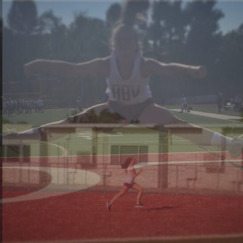
This photo of me represents that I enjoy to cheer and run. This picture was taken on a track which is where I can go if I ever want to do either of those things. Cheer is my number one hobby and on my free time I can run which is my second favorite hobby to do.
